Logo of the Month – FedEx
3rd October 2016
Posted By: Chantelle Mills
Sitting here after my latest internet shopping spree surrounded by courier packaging and instead of channelling my thoughts into how much money I shouldn’t of spent, I begin to cast my eye over the various logos. Suddenly I start to feel better and tell myself that if I didn’t buy these things I wouldn’t be sitting here writing a blog on a Monday afternooon, therefore the money I spent becomes invalid as this is now classed as research.
Out of all the company logos I see in front of me FedEx is the one that catches my eye the most. Now I don’t know why this is maybe it’s the vibrant colours, since opening Bostin Design anything orange catches the attention of my eyes. ‘Bostin orange’ is now a term often used amongst colleagues, friends and family. Every birthday or Christmas I am inundated with various Bostin orange gifts from flowers, shower gels to socks; when will the people closest to me realise my favourite colour is purple!
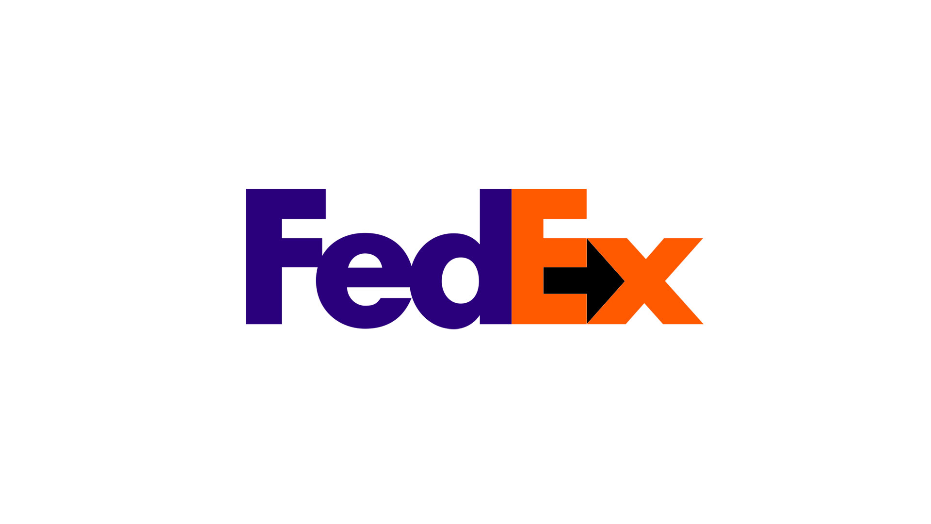
Back to the Fedex logo, this logo is legendary amongst designers. It’s won stacks and stacks of awards and I challenge you to find a ‘best logo designs’ list where this isn’t mentioned. What’s so special about this logo? Maybe it’s the clever use of the negative space arrow between the E and X, that I continuously point out at any given chance when discussing the with logo or company with people that don’t have a clue it’s there. I mean once it’s pointed out to you it’s hard to see anything else! Similar to the image that was flying around social media of the cigar hidden in a brick wall, once you spot it you feel slightly idiotic that you didn’t see it in the first place.
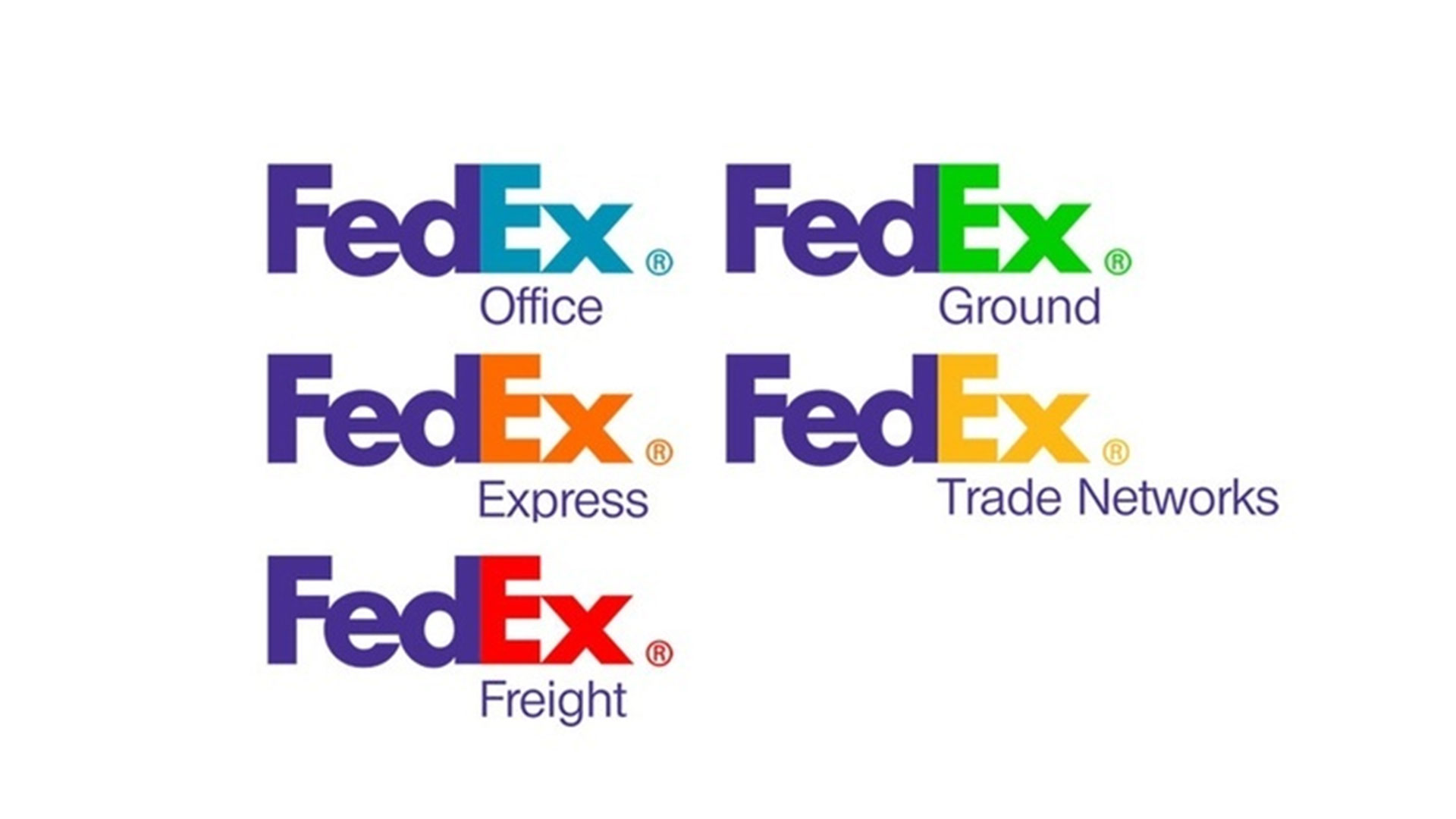
Again back to the logo, it was created back in 1994 by Lindon Leader whilst working as a senior design director at Landor Associates in San Francisco. The Ex signifies different sectors within the company and can often be seen in orange (express), red (freight), green (ground) and yellow (trade networks).
Today the FedEx logo is over 20 years old and is still as good as when it was created back in 1994. It’s bold nature and clever subliminal design stands out from the crowd and this is why we still talk about it today. I’d say that was a job well done, wouldn’t you?